vets on call
Vets on Call is a unique, easy-to-use mobile app that delivers high-quality veterinary care at home.
I was part of the team that redesigned and created the platforms and experiences our users would use to provide this unique service for both the pet and pet owners in Melbourne.
the goals and vision
giving a pet their best life
Vets on Call’s vision is to provide every pet owner the information and means to give their pet it’s best life. Their mission is to democratise the pet care industry and become the preferred choice for pet owners and vets.
We had a goal to hit 100,000 active users and subscribers to new health plans and also hit 100,000 app downloads.


my role
ux•ui design
I was part of the design team for VOC. I started with helping in branding and graphic design and moved towards more UX/UI related jobs with their app experience, and website redesign.
I worked closely with the marketing team and stakeholders to execute a strategy that would reach business goals.
hiccups
The biggest challenge was balancing the different tasks I had. I came on as an UX/UI designer but because of my GD background I agreed to help in some graphic printing, branding and ad work. We moved fast, so the process was blurry. Learning how to do research on the fly, and also make deadlines and deliverables was something I had to adjust to. Compared to an internship where I had the ample time and space, this was different. Finding the time to do testing, and gather user insights was tricky but working along side a marketing team would prove a life-saver.
research
current analytics
First off, understanding where Vets on Call currently stand was important in moving forward. This would help us figure out what it would take to reach the new objectives.
Downloads
Total current: 6,973
Yearly average: 3,337
Daily downloads: 9 per day annually
Registered users
Total current: 3,725
Yearly average: 1,862
Daily downloads: 5 per day annually
Bookings
Total current: 800
Yearly average: 400
Daily downloads: 1.02 per day annually
Protection plan subscribers
Total ever subscribed: 10
Current subscribed: 2
THE PROCESS
The project was broken up to two stages. Tackling websites and then improving the app experience. In our initial kick off meeting we discussed that the existing VOC website lacked the necessary information and call to actions that we needed. Looking at analytics there was a gender split of Males: 75.1% and Females: 24.9%. Our audience at 28% were 25-34 year olds. Followed by 20.43% of 35-44. Under 25 year olds were nearly non existence. I began thinking how we could target more females, and how our design decisions could swing towards capturing a younger audience to better optimise our traffic.

Bull's eye & Activation Audience
personas
Without a clear process to abide by, the marketing team was pressuring me to begin designing a landing page to promote their 'free trial health plan campaign' and push customers to the new VOC offer. However I wanted to get my head wrapped around the brand and target audience first. When there is no clear process to abide by, I always start with the user, or co workers in this situation. We started with quick brainstorming sessions where we quickly workshopped some personas and came up with two key audience profiles.
Primary audience profile summary
• Women, 18 - 35
• Convenience
• Frustrations are: Time poor (self-focussed)
• Low knowledge on animals & care
• Not good at remembering to schedule regular check ins
Secondary audience profile summary
• Women, 35 - 55
• Part-timers or stay-at-home mothers
• Convenience
• Frustrations are: Time poor (family-focussed)
• Clinic visits are stressful for her, as well as her pet.
• Wants quality care
visual style
ui decisions
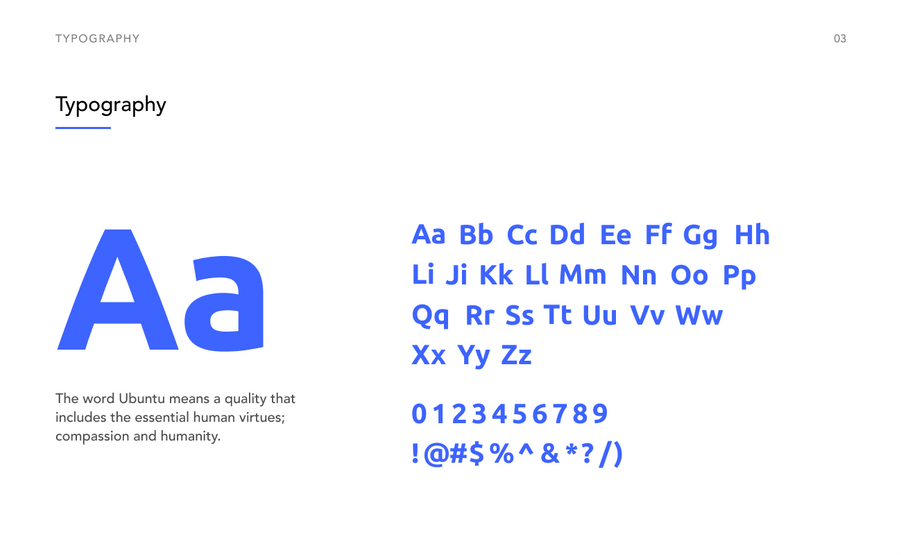
Creating these personas went a long way in terms of helping me quickly grasp who I was designing for. Along with this I quickly put together a brand guidelines for future graphics and UI work, so that the team could be aligned going forward with our visual style.
The Vets on Call branding going forward for our websites and app ideally will lean towards a more modern approach to appeal to a younger audience. It was noted that once the website was complete we would review the design and branding of both the website and the app.
landing page + redesign
websites
With this as a base, I fleshed out a landing page fairly quickly. Focusing on the call to actions and health plan listings as the focal point of the page. The page was then coded by Nila on our marketing team. https://go.vetsoncall.pet/health-plan
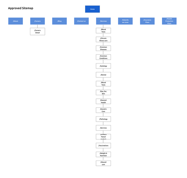
This was a bite sized job for the bigger vision of the website redesign. The existing VOC website lacked the necessary information and call to actions that we needed. It was important for me to get a grasp of what the existing site looked like. So I created an existing and proposed site map, this helped me get an idea of what we could improve on and what could be adopted to the new.
information architecture
navigation/CTA
A key proposal by the design team was the use of a meta and main navigation. Just looking at the existing website it was clear that we could not fit everything clean on one menu. To avoid cluttering the nav we decided to split the main content to the main navigation, and secondary items into the meta nav. This was welcomed by stakeholders immediately. See the live website here. https://vetsoncall.pet/index.html

more hiccups
Another aspect of the homepage that needed addressing was the Call To Actions. Speaking to our marketing team, there was an underlining issue of our existing website not having a clear action for our users. The main thing our customers reported was that their goal was to book a vet, this was not evident enough in the design and layout of the homepage. We needed a layout to accomodate the different navigations but also allow enough direction to our 'book a vet' buttons.
To add more difficulty to this task there was a plea from the marketing team to add a 'download CTA and 'phone us CTA.' The problem was that there were a number of requests to add more and more CTAs. I thought it was becoming overkill, but the team was adamant it was needed. To avoid the homepage being bombarded with buttons I went with more white space to allow the page to breath and allow our users to clearly see where the CTA's were.
improving the VOC app
Vets on Call offers the following functionality:
Book your vet with a simple three-step process
Browse vet profiles, reviews and ratings
I lead the UI/UX team at Newpath Web along with a Google app partnership team to deep dive into the existing VOC app to discover how the experience could be improved and redesigned.
first step
utilising (aso)
Improving the visibility by leveraging App Store Optimisation (ASO)
The mobile app scene is growing everyday. Everyone lands on the app store. While all installs occur on the app store, users behave differently before choosing to install or to drop. Using App store optimisation (ASO) is a way I could help drive significant amount of downloads with minimal costs.
Like creating an improved App Store Landing. This will increase install rates, conversion rates and improve the rate at which users install our app once landing on the app store page.

the strategy
We discovered that the first two screenshots can increase conversion rates by 25%. We strived not to be repetitive when designing the 3rd – 4th screenshots. And we knew that switching app screenshots could increase install rates by more than 35%. People generally only read the first line of the description so we had to make it count. Although I was new to this, learning about ASO was helpful. My graphic design background definitely assisted me in designing the screens. Below is the existing screenshots used, basic feature list and screenshots of the app. I definitely felt improving these was an important step to drive more downloads.

design for attention, increaSES EXPLORATION
improvements
Not only did we need better images, this needed to be paired with a clear call to action
We combined the message with eye catching images. Creating a story through the screenshots, but also allowing each screenshot to stand alone.
People are automatically drawn to faces and eyes in particular due to the development of part of the brain known as the Fusiform Gyrus. Using people's faces has the biggest impact.
the next step
improving the ux of app
Once we figured out improving ASO the next step in our user journey was opening the app. We found that people were excited to use the App - but they bounced as soon as they found the app too hard to use.
We first looked at removing pain-points for conversion in the app by looking at the UX from the start of a user journey.
Figuring out a way to show the value of our app upfront by introducing our value proposition earlier. One thing we did was differentiate our product and brand with additional cards after the welcome screen. The purpose of these cards were to communicate our competitive advantage and why we were different so users could easily decide to convert
onboarding
personalising
A big part of our experience discussed by the team was that our app was to be felt personalised. That we are looking after the users and their pet's needs.
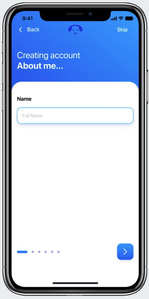
Improving this was crucial, but in order to do this completing the simple questions at the start of the app had to be better. Completing the setup also served as a primer for how the app works. Answering the questions also has clear utility for the user, as doing so automatically sets up their profile and their personalised dashboard.
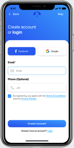
First we minimised the steps before engagement, offering a skip registration process so some users could have the freedom to engage the app without signing up. Originally there was 12 onboarding steps to complete registration — which we reduced to 6.
ui decisions
To draw users from the point they realise the value of our app to the point where they act on our value proposition, and strategically thinking about how to influence that decision was crucial. Using carousels with images instead of static text boxes to give additional context would help highlight and add value to each offer. Also using hierarchy to order our services to match the most commonly used features in the app. Let it be Pet Insurance or Wellness Programs, we needed to give our users understanding of each service.

reflections


