
Lone star overnight
LSO is the leading overnight delivery shipping company. LSO combines the speed of a courier, the discipline of a carrier and the service of a true partner.
This was a project that needed design management and technical insight. I worked closely with Anthony a PM at Outliant who specialised in development to scope out the timeline, product system, and client needs.
My role
ux•ui lead designer
My role on the team was to first manage and lead the client in all UX consultation meetings. This role morphed into visual design, and research as well. I promoted user-centered design throughout the design process which helped define the product and improve the overall UX to achieve LSO's business needs.
understanding the technical product
the challenge
The initial challenge of this project was taking over a project that no one took the time to fully understand. The client wanted a reface of their website but also highlighted many issues of their current system. Understanding the ins and outs of their existing LSO Webship product was the first thing we had to grasp. Only then could we focus on improving UX.
Working with the internal LSO team we scheduled Webship training meetings — this is where we asked questions walked through the process of signing, shipping, and tracking items.
the approach
timeline & DESIGN PROCESS
as UX manager on this project I had to work with the PM to scope out the timeline that would meet deadlines and deliverables, we also had to work with a dev team to scope out a build phase and time frame. This was then approved by client.

I used a design framework of a previous sprint format I've used before. Knowing the complexity of the product I knew we would be going back and forth in the prototyping stage so I accounted for more time here. I then broke down the design process and design phase into our management tool Clickup. This just gave us transparency and clear vision — so that the client could see and be involved with our process from start to finish.


resarch and discovery
ux consultation sessions
I went through company brand values in the first UX session we set up. The values of the company would help align the team and get the discussion flowing. We would continue to refer back to this exercise to make sure we were on track.
Goals of these sessions were:
• To identify issues and pain points in the current product or process
• To generate general discussions about the need for an improved user experience.
• Get clear momentum and a sense of how to get there.
• To prioritise from a UX point of view
• To help the team decide on the next steps to address or improve any of them.
• Go over key user journeys

business needs
ux requirement list
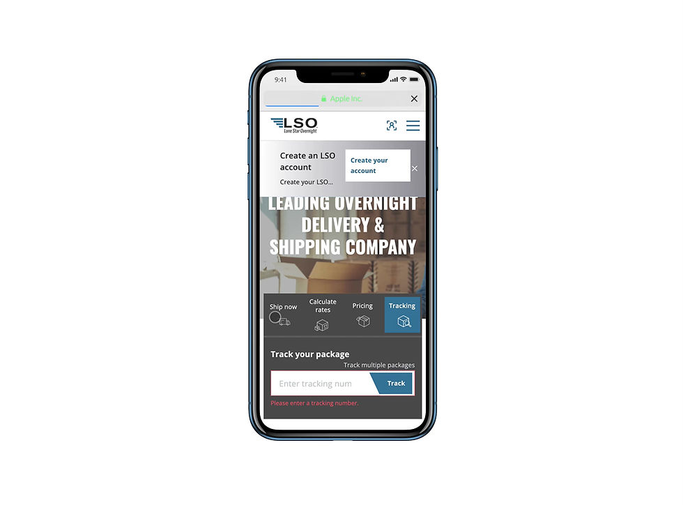
Landing page: A clear landing page with a clear CTA. What is our main call to action?
Tracking: one click away tracking feature, displayed on every page.
Accounts: business or personal accounts for each user journey. Personalized profiles, with a list of services and products. A clear distinction between the two.
Branch locater: How to direct users to branch locations
Webship revamp: Better experience of printing and setting up labels
Shipping services: Templates that can effectively and clearly state what LSO provides, the value of those services
Latest news and blogs: How can we promote and direct users to read more news and blog articles relevant to them
Value: Value for users that choose LSO and visit LSO website
Project goal/expectation:
"The goals are updating the current site to a more modern and cleaner/simpler flow, with the freedom of starting from scratch we want better customer segmentation. Clear understanding, ...If this is the type of business you have...Then this is there service to choose.”
target users
personas
In the next consultation session we worked through personas and key target users. We split the users into 4 main categories
- New clients looking to ship
- Eccom, (50+ packages per day)
- SMB (11-40 packages)
- Self serve (1-10 packages)
We then went away and dived deeper into these personas doing some of our research and brainstormed in the team goals and pain points.


persona key insights
Warehouse Wayne: A good report page, with table and information, will do good for all personas.
Director Dan: Track your order, be able to view that order, and have a CTA next to that to make a claim, even have it auto-populated.
Lanyard Lisa: Show rates with cards easy and clearly, Wants to see rates and services that apply to HER only.
Shipper stacey: Past shipping histories that she can use again. Existing shipments, view shipping history.
Blogger Brenda: A clear About us page for Brenda. We want her to test out the shipping UX process by ship with credit card.
Admin Alan: Needs to be able to log in, go to accounts, and view his status on his deliveries. Ability to modify delivery times, In the order it self. View shipments and also be able to edit delivery. Schedule pickup is a page, with options of pickup
S.W.O.T session
Another UX concept I like to run is the S.W.O.T exercise. This was great to link many of the assumptions we had of the existing and proposed website to actual user needs.
In this session we had a few departments of LSO and also key stakeholders in the company to help us align on some key strengths and weaknesses we found in the current product. We then brainstormed together on future opportunities, to get the ball rolling on.

benchmarking
We then asked the client to send through some examples of what they were envisioning their website to look like.
We also did our own research and presented our findings to them. We looked at rival companies, companies in their area regionally, and nationally.
We studied other products to see how their IA was structured. This was important as we were moving into the sitemap phase.


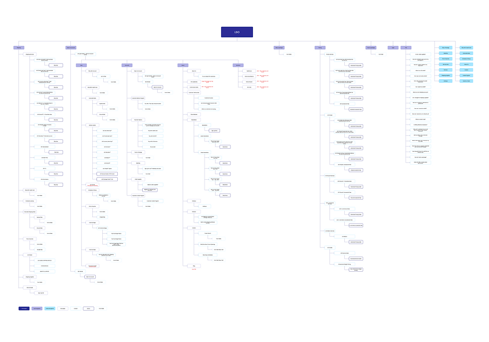
existing sitemap
research
We first mapped out their existing information architecture. This was a feat in itself as their site had many levels that seemed to lead to no where. To prove that these were not just our own assumptions, we drew out some user flows of their existing site map to alleviate any of those concerns.
research
existing user flows
Above you see that the current site was extremely content heavy. Some of the notes I had while going through this was where could be solidify some of this information? Could we combine some of these pages into one? Based on the consultation sessions we had with the client and the UX requirement session — the sitemap could be simplified into the key user needs. The proposed sitemap would be much cleaner.


ideation
proposed sitemap
Above you see that the current site was extremely content heavy. Some of the notes I had while going through this was where could be solidify some of this information? Could we combine some of these pages into one? Based on the consultation sessions we had with the client and the UX requirement session — the sitemap could be simplified into the key user needs. The proposed sitemap would be much cleaner.


wireframes
ideation
I roughly drew out these wireframes focusing on the main functions. Identifying the templates in the sitemap really helped this process out. There were some screens that we had to really think through in terms of what functions the users needed. We really improved the product pages, including a robust filter function for them. With LSO having a really long list of delivery products we had to find a way to efficiently list them without users having to click too many times. I also took the time to bring the navigation and menu into a med-fi version. I believe getting this right really helps the rest of the UI come together.
branding
visual identity
We then put together a brand identity PDF for the client. We do this so that we understand ourselves the style of the UI moving forward, but it was also scoped in the kick off that we would help them with a brand identity. Although we kept the Oswald font on the brand identity we communicated to the client that we would be using another font for the redesign of the website, communicating this early was crucial.
high fidelity
prototyping
With the brand identity approved. Rolling out the UI was a fun and easy task for me. There were some pages like the account templates that we had to rethink. It wasn't ideal to come up with a solution this late in the process. This should have been solidified during the wireframe process.
But because we do not understand fully how their account system would work, and what needed to be included. There was heaps of iterations that had to be corrected. This slowed down our progress and delayed our timeline slightly. Luckily the client was understanding and gave us ample time to figure it out before dev commenced.
development and hindsight
bring it to life
We would then go through many client presentations that would require us to make amendments. We tried limiting the rounds of feedback, but this is always never as black and white as it seems.
Once we did get approval I sat down with the devs for a walkthrough and went through our design documentation. Moving forward we would use BugHerd to review development. The site just went through UAT. We are still going through minor front end fixes. https://www.lso.com/


hindsight
things to do better
I had an internal meeting with Anthony the PM to discuss going forward with projects with complex systems — to allow a decent amount of time to figure out the key technical processes of the product. As mentioned at the beginning of this case study, that was the biggest challenge we had. We wasted many weeks trying to figure out details of the product that were not made aware to us from the beginning. This brought up missing screens and missing user journeys that we did not account for. Understanding the business and the product is vital in creating a better product and will eliminate the back and forth of amendments from designer and client