
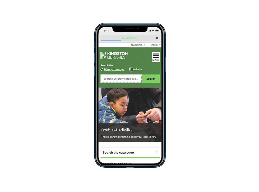
Kingston library
Kingston Libraries assists the council to provide equitable access to a diverse range of social, educational, cultural and recreational resources, as well as providing for partnerships with the community.
I was part of the team at Newpath Web to develop a website that empowers the Kingston community to engage, and connect with the resources they need. This product would be used at home and at the library for all users.
ux•ui design
my role
During this project I was working as a UX/UI designer at Newpath Web. A full service digital agency with a team of professionals that helped the design process and development. I was the lead designer for this project and worked closely with a fellow UX/UI designer Seah Ho to deliver designs, and address customer pain points. During these 12 weeks we would report to our BA and project manager who took care of planning, scope, and oversight. The designers would take care of the customer insights, design execution, user experience and visual design.
initial meetings
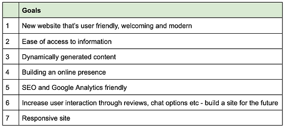
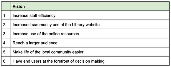
vision & goals
In three years’ time, the Kingston Library website would be the first-place community members think of when they’re looking for resources to fulfil recreational and informational needs. The library website will provide visitors with a holistic experience as natural as that of visiting a physical library branch. In five years’, the library website will have continued to evolve to keep up with the changing needs and expectations of our community.
This vision and goal was established early in our kick off meetings. Here we discussed the needs of the project, the overall process we would take and what the client requirements were.
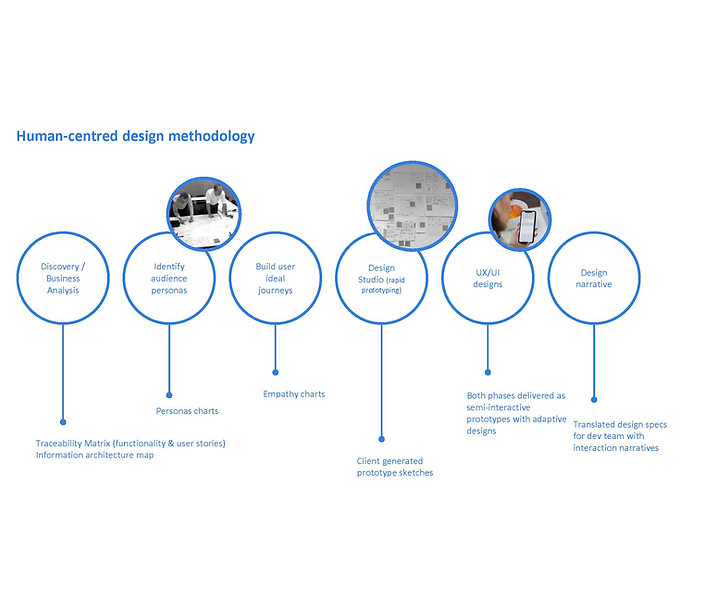
template mapping & HCD
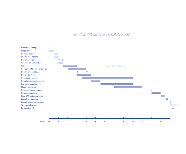
the process
Newpath Web operates under an Agifall methodology (waterfall methodology with Agile principles) with human centred design thinking applied. We would start with discovery process and from there a document is created that focuses on the vision and scope. The result of this combined method is that the timeline speeds up considerably and errors are detected sooner and sent back for correction while keeping our core objectives and vision at bay.
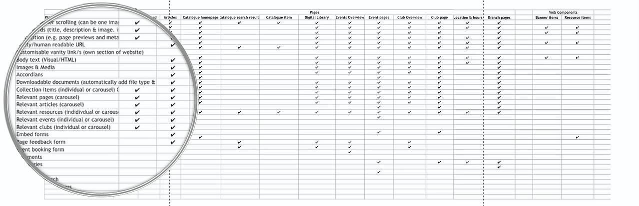
Once a rough traceability matrix was created during our discovery meetings with the client, we began to map out the existing website, with rough IA maps and screenshots of key functionalities. This would help us figure out and indicate how many templates we would need to fully address all users' needs.
STATIC AND INFLEXIBLE
the challenge
Problem statement: The Kingston community was not engaging, or connecting with the resources they had. Our existing website was static, inflexible, and non-responsive. It was originally built as a small part of a broader council website development project and there was little understanding of the complexity of the library services. Resulting in a poor user experience for many users. Furthermore, as the website is currently built on a proprietary CMS, template changes are costly to implement. This has resulted in a website that has been unable to evolve to meet the needs of our community.


analytics and key tasks
the breakdown
Annual snapshot & baseline of data for success metrics:
• 29,600 active borrowing members (approx. 18% of the local population)
• 650,000 in-centre visitors
• 114,000 website visits
• 850,000 physical and 76,000 digital items borrowed
• 65,000 reference and technical inquiries
• 49,000 program attendees (96% in early years literacy and primary school programs)
• 56,000 wi-fi sessions
• 59,000 library computer sessions
Key tasks Our customers visit our website for:
• Informational e.g. Library locations and opening hours
• Organisational e.g. Manage and renew loans
• Download content e.g. eBooks and eAudiobooks
• Research e.g. Family history• Entertainment e.g. Events and activities
• News e.g. Literary award winners
• Get in contact with us e.g. Suggest and item for purchase
• Educational e.g. How do I write a resume?
research
personas
The customer base is broad. The library serves all who live, work, or play in the City of Kingston. In addition, Kingston Libraries memberships are free to anyone who is a resident of Victoria, with other membership options available to interstate and international visitors.
Kingston is a culturally diverse city with residents from over 150 countries who speak more than 120 languages. About 30% of Kingston’s population was born overseas, with 22% from non-English speaking backgrounds including Chinese, Greek, Italian and Indian. The proportion of residents who speak languages other than English is increasing (notably Mandarin, Hindi).


When creating the different personas, it was important to research the current Kingston population. Through the help of the client and our own research we found that
there was a
• a median age of 40 years, compared with 36 in Greater Melbourne
• 0.4% of Aboriginal and Torres Strait Islander origin
• lower than average levels of social and economic disadvantage (SEIFA Index)
• above average incomes
• 13% of households with no home internet connection
• 25% single person households
• an increasing number of people needing disability assistance (5%)


user journeys
We went over the personas with the team, and then had discovery meetings where we brainstormed the user journeys from these users. We wanted to create as much insights from our discovery work indicated many areas where our web-based solution could help to improve the day-to-day lives of personas.
From these user journeys we realised that we needed a welcoming platform to all current and potential customers of Kingston Libraries. A one fit all solution, where the website will have everyone's need. The site will entice new members and also satisfy existing members.
A key take away was that those who are not overly confident with technology or comfortable with the Internet need to find Kingston Libraries to be a welcoming, user friendly starting place, where they can not only access library collections but learn more about digital technologies in a safe environment. Our website can help them build confidence in navigating the Internet and develop digital literacy.
ideate & Design
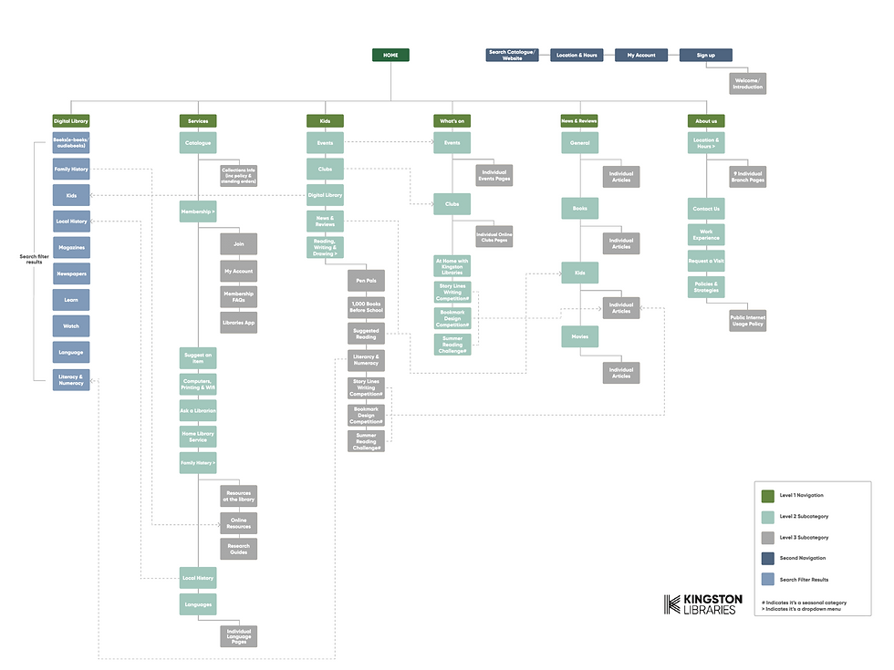
sitemap + Wireframing
The next step was to solidify the key functions of the existing service and website. Mapping out the existing website onto a site map really helped the team get their head around the key functions. The key take away from these discussion and deliverables were the importance of including
-
Events listing/booking calendar system
-
Social cards: The ability to determine image, title and description that will pull through on social channels such as Facebook.
-
Social media integration: Enable library customers to connect to their Goodreads account (via Goodreads Connect) to pull in their ‘to read’ list. The website will then query our catalogues to show if items on their lists are available (complex option) or generates a search query button (simple option).
hiccups
After the site map, drawing up the wireframes was the next step. One issue with the wireframes was how detailed we presented them. The design team had a discussion that we might have a gone overkill with these screens, expending too much time on these — when we could've used a leaner approach with more client feedback.
This lead to a hiccup with getting the wireframes approved. We stressed that the wireframes were only for solidifying the functionality, which we had to repeat a few times. One thing that helped was stripping back the detail of the wireframes, a simple approach, and many video walk-throughs to communicate the functionality — was key to getting the wireframes approved.


LOOK AND FEEL
IMPLEMENTING THE UI
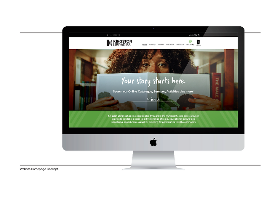
Originally this was the homepage concept for look and feel of the interface before we started our process. Even though we worked with the client with the initial look, it's important to understand that we need our UI to be a product of the user's needs. If we had started with the UI and worked backwards, it would be obvious that we would be missing many core values and features we discovered important to our site. This was a good reminder of that.
assets and wcag 2.1
The Kingston's graphic team were adamant on including their branding through the website. We wanted to tackle this early and bring to life a few mockups of what that would feel like. To do that we would start by setting up our colour styles, and text styles and also gathering our branding and patterns to incorporate into the design.
Kingston branding had many colours, incorporating all of them into the website seemed a daunting task. I found that separating the main Kingston colours and then the supporting colours helped a great deal with implementing the UI. Something that I'm always trying to keep at check is how the design will comply to wcag 2.1 standards.
Deciding which colours to be used for readability is important as we are trying to cater to a diverse community with different needs. I used https://accessible-colors.com/ to help me check whether our brand colours would work against our text colours.


collaboration
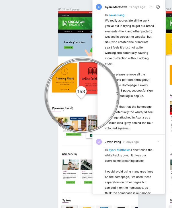
Thankfully we managed to build a strong collaborated spirit between the Newpath design team and Kingston graphics team. What helped the process was including them in many of the design decisions and suggestions that we would advise on, explaining our design decisions were crucial to a smooth transition of UI approval.
Government jobs can be tricky, as there is a huge team behind the process of design. I had heard of many projects going downhill because there of the many parties that needed to be satisfied. With the approval of the wireframes delaying our timeline. We moved to the UI relatively quickly.
This communication lead to a very happy outcome of our third draft. The client and stakeholders were thoroughly impressed. I think using the in-built Figma commenting function, really helped shape our collaboration across teams, we were able to identify and amend things very quickly.
getting the design right
A fun aspect of the website was designing the look and feel of the different cards. The experience of these had to please a range of users, from young to old. English to non-english speaking backgrounds. We had to remember not many of our users were tech savy. Thankfully I believe the wireframes made this section a lot easier. Slugging out the functionality of the cards early on meant that we had already answered many of these questions.
Kingston Libraries is committed to responding to the social needs of a diverse community across all life-stages, and backgrounds. Promoting social inclusion, life-long learning, and supporting the community to be meaningfully engaged. We tried creating the UI to reflect this. Designing UI cards that have clear call to actions, modules that promote on-going engagement, and removing any fluff that would distract from user goals. Going forward only testing will tell if we have achieved this.

design narrative & Bugherd
bringing it to life
As we move through development stage, it is important we communicate effectively our vision to the dev team. Creating a design narrative is imperative for this to be achieved. Using our design narrative Figma template we can copy and paste all our components into this template, showing exactly what interaction does what. This allows for best practice and saves us mountains of time.
We also will be monitoring and reviewing constant sprints using Bugherd, a service Newpath has subscribed to that allows us to make comments, complete tasks that we have observed, so the dev team can be updated.
View the final product: www.library.kingston.vic.gov.au/